css
Responsive Tables
What is this?
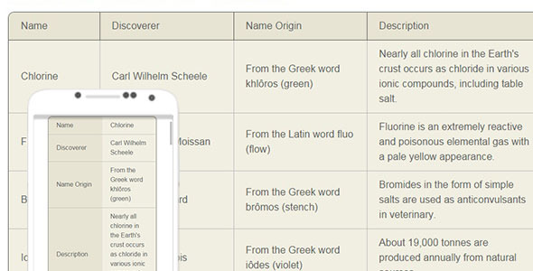
This a ready mobile-first CSS solution for responsive data tables. It is also a configurable CSS mini-framework.
Why use this?
- CSS-only, no Javascript required
- wide browser support, including IE8
- mobile-first approach
- list-based layout
- predefined layout types: up to 12, up to 15, up to 30 columns, ability to easily add custom layout types
- stackable information
only desktop view is available on IE8, which is fine because IE8 is only used on desktop devices
Please note: the suggested HTML structure is built with ul, li and other elements, but NOT with table element.
What can be customised?
- columns number
- column widths
- breakpoints
- all colours and text styles
- cell padding
- borders (colour, thickness, presence/absence)
- corners (border-radius)
Extra
This is normal and ready CSS solution, but for those who are in favor of CSS pre-processors, LESS source files are also included.
Changelog
v0.1 (1 September 2014)
initial release
v0.1.1 (3 September 2014)
layout bug fix for very short words
More in css
-

Havestar -Mega Menu
Havestar & 8211; Responsive Mega & 038; Dropdown Menu is a fully responsive mega...
-

TechButton – Tailwind CSS 3 Button HTML Template
TechButton & 8211; Tailwind CSS 3 Button HTML Template, the ultimate Button Style! Crafted...
-


Animated Mega Menu CSS3
Animated Mega Menu CSS3 Elevate Your Website Navigation with a Stunning Mega Menu! The...
-

Safa – The Most Favourite Premium Pricing Table
Premium Pricing Tables is a set of professionally designed pure CSS3 pricing tables that...